Overview
The Problem
EmployBridge is a staffing company that operates by paying workers placed on job assignments for billable clients.
To ensure we're billing and paying accurately, a subset of colleagues is responsible for fixing pay & bill errors that occur
outside of the usual payroll cycle, due to reasons such as
late payroll changes or a client not approving hours before a deadline.
It was uncovered during earlier payroll-related research
that the current adjustment process is inefficient and tedious for our colleagues.
The process requires them to manually enter large amounts of data and visit multiple databases to find
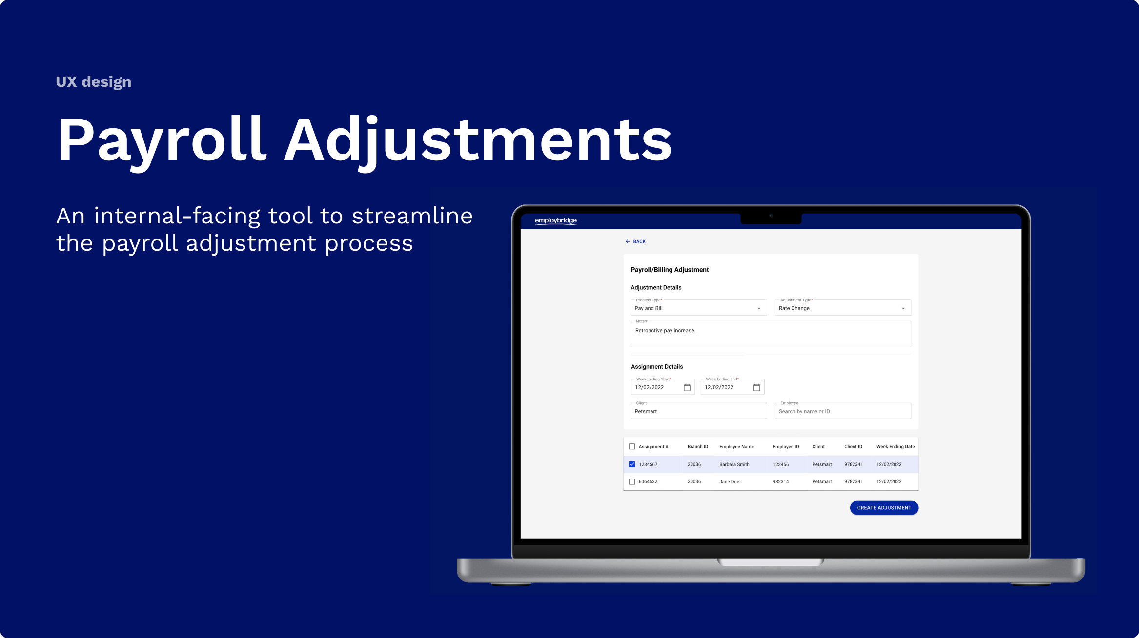
necessary information. I was tasked with designing an internal tool to help streamline this process
& address pain points.
My Role
Sole Designer, responsibilities:
User flows
Wireframing
Prototyping
Usability testing
Goal
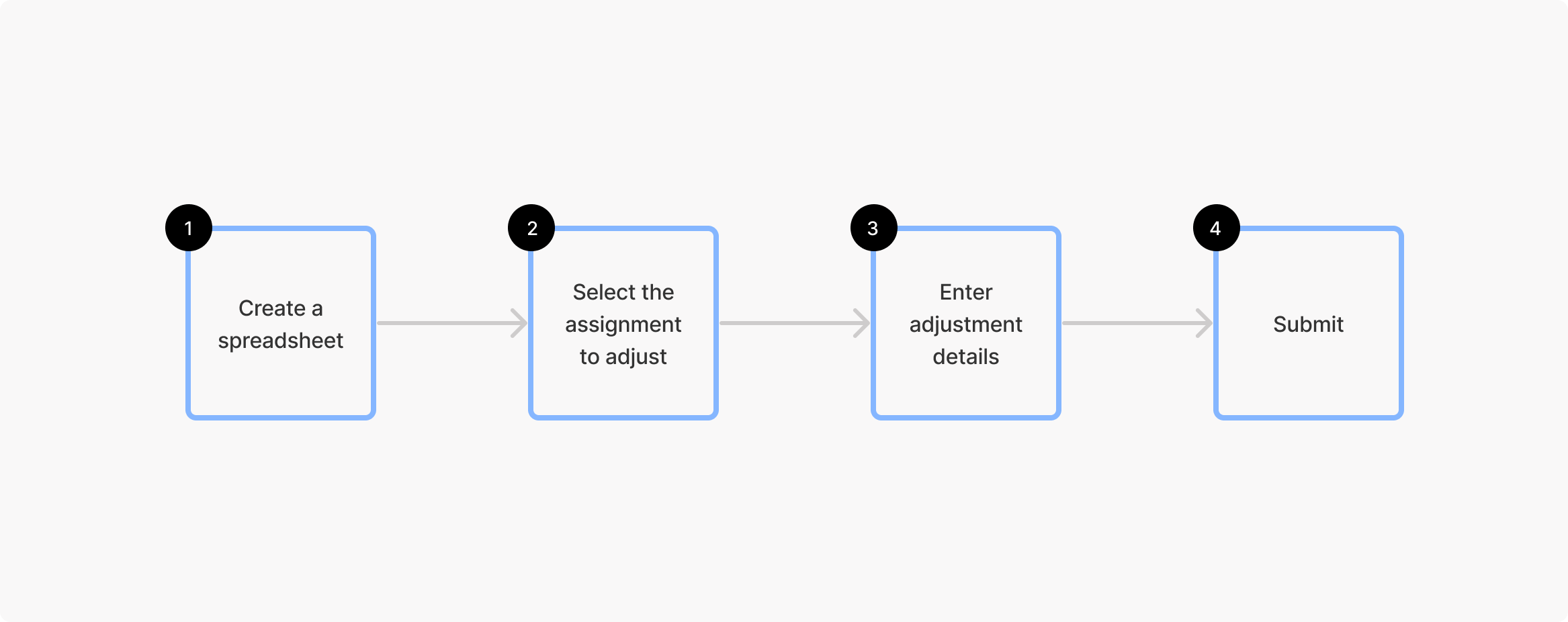
The goal with this new experience is to create a more streamlined payroll adjustment process with fewer steps for our users.
Impact
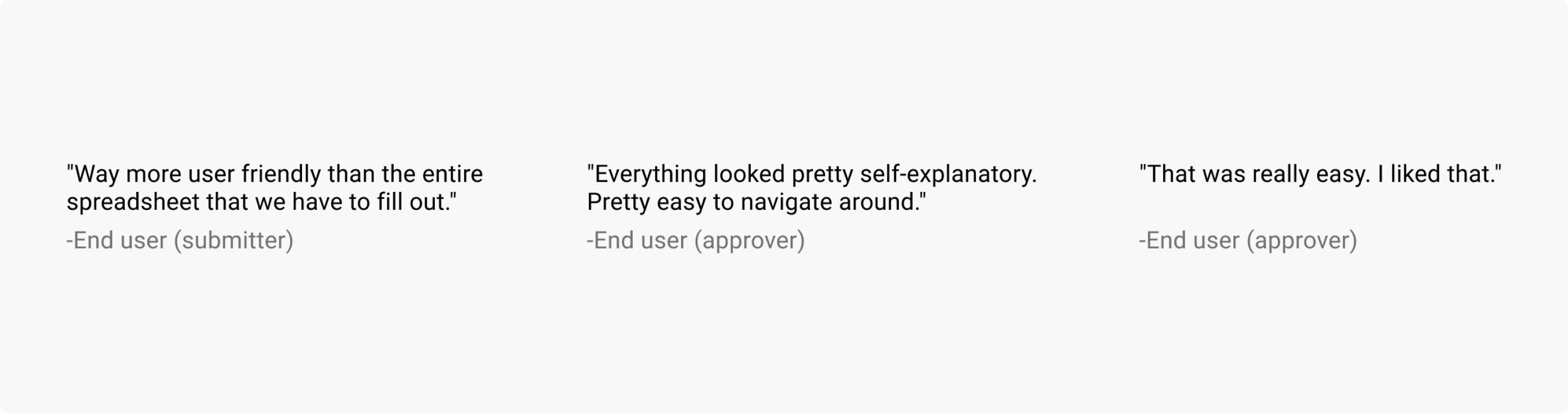
The improved payroll tool design is "way more user friendly" and "really easy [to use]", according to our users. It cuts the number of steps to submit an adjustment in half and eliminates the need for users to jump between databases, centralizing the process.
Discovery
Reviewing the current process
I spent the first part of this project gaining context & trying to understand the current state of the adjustment process. This need was uncovered during research for another project, so there were a lot of user interview recordings and documentation available that helped me understand the pain points our users were facing.
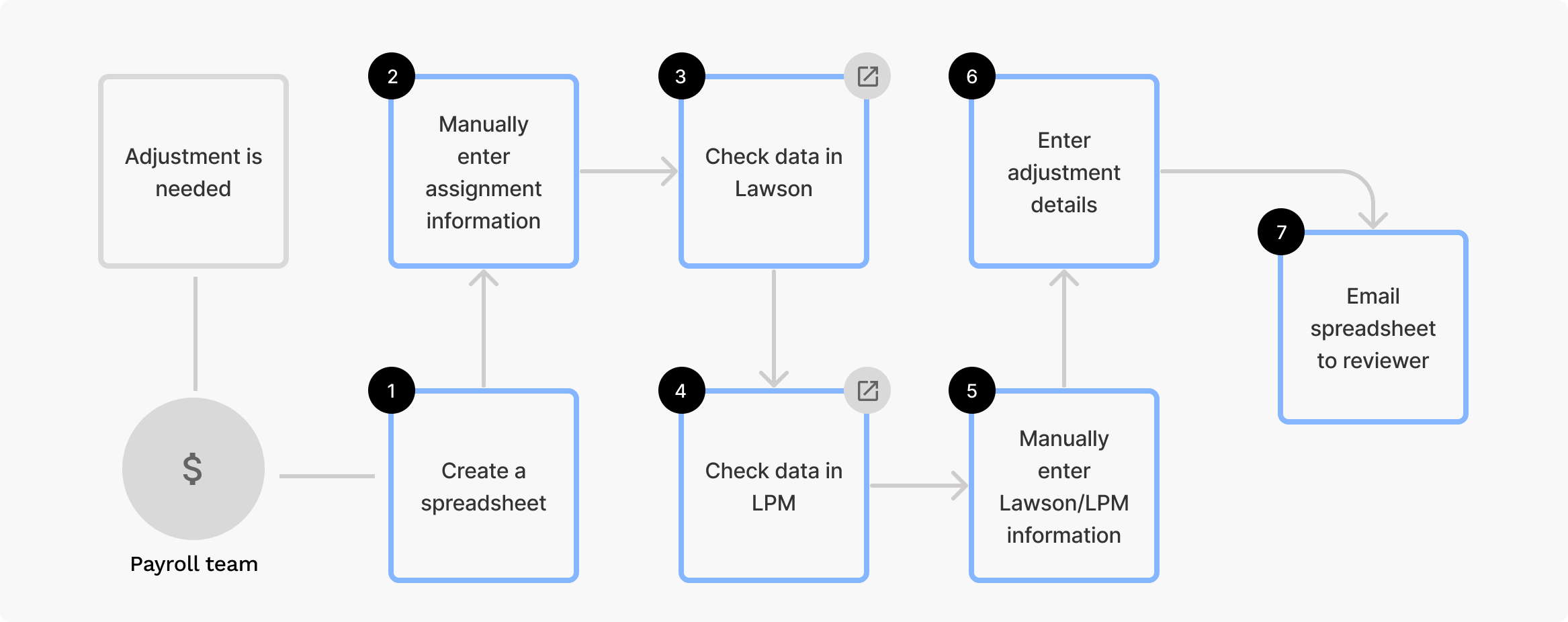
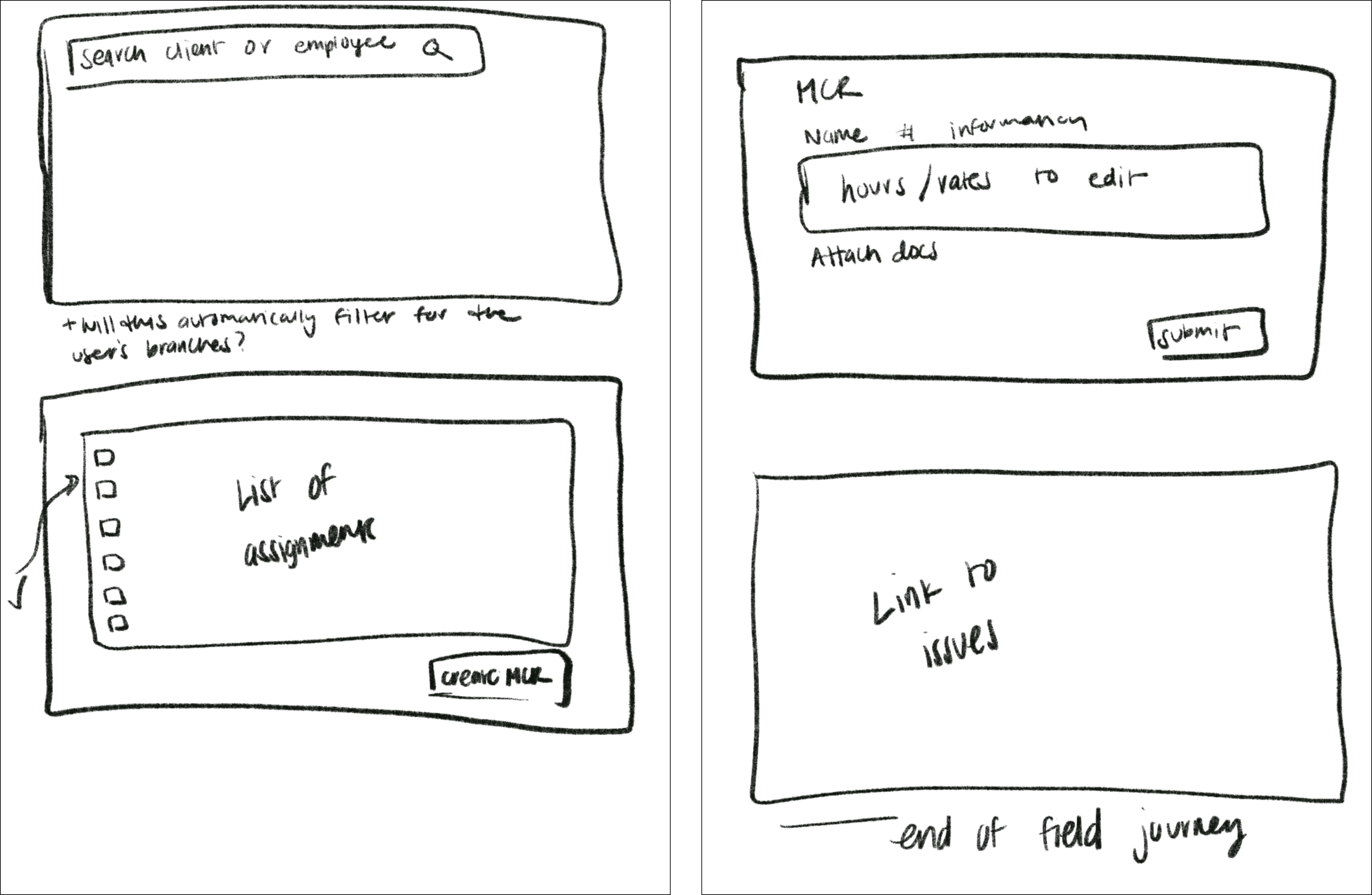
Overview of the current process (see flow diagram below): There are two user groups handling this process - field colleagues submit adjustment requests which then get reviewed and processed by corporate payroll colleagues. The current process is very manual - field colleagues will fill out a spreadsheet and then email it over to corporate payroll. In order to fill out the sheet, they'll have to visit multiple databases for information. The user flow below shows the current process of submitting a request.
Design
Initial ideation
Once I had a better idea of the problem at hand, I started out by sketching ideas before moving into Figma. I was provided with a flow diagram by the PO of the vision for the future adjustment process & I used this to help guide my initial sketches. However, I realized while starting to design that I had a lot of gaps in knowledge and questions about the process and our users.
To move forward, I set up a call with two SMEs. They ended up being really helpful resources and, as I iterated on my designs, I would go through the wireframes with them to make sure they made sense from a process perspective.
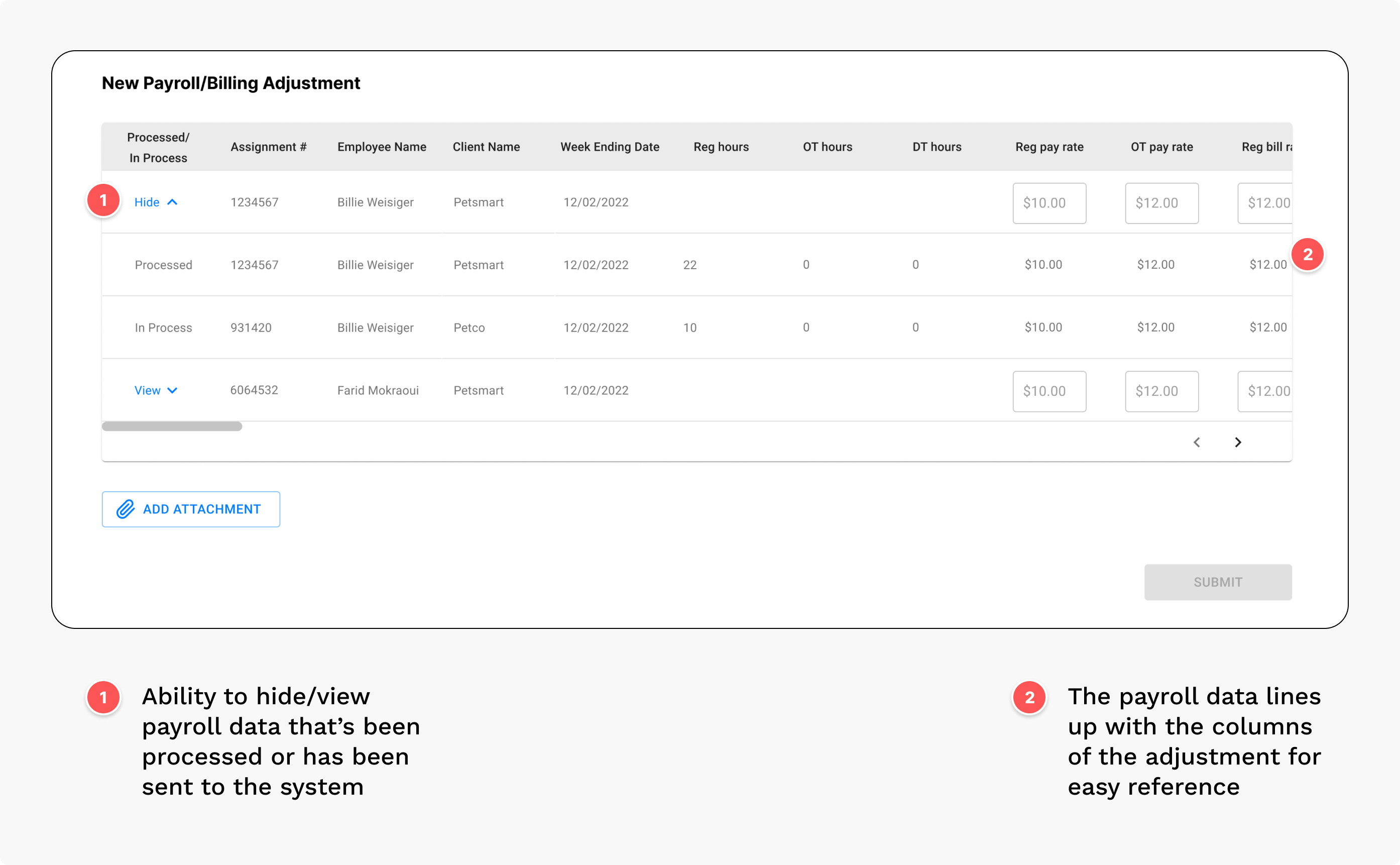
Key design feature: Eliminating "swivel-chairing"
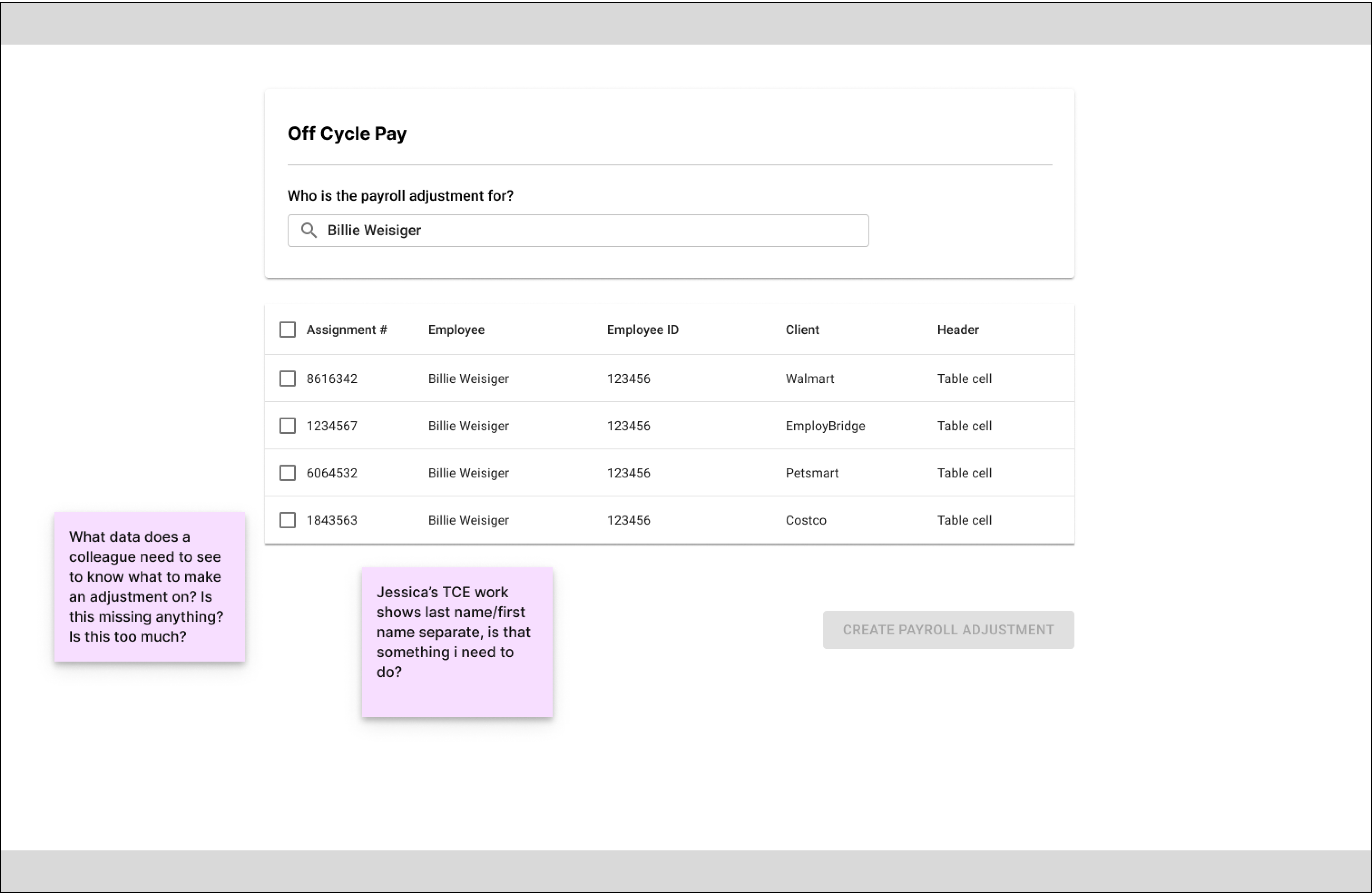
A big goal of this work is to eliminate “swivel-chairing” - aka users needing to toggle between different apps to complete this process. This was accomplished by pulling in data from the two databases users currently have to visit. In this new process, when submitter is filling out what needs to be adjusted, they can reference it in one centralized place.
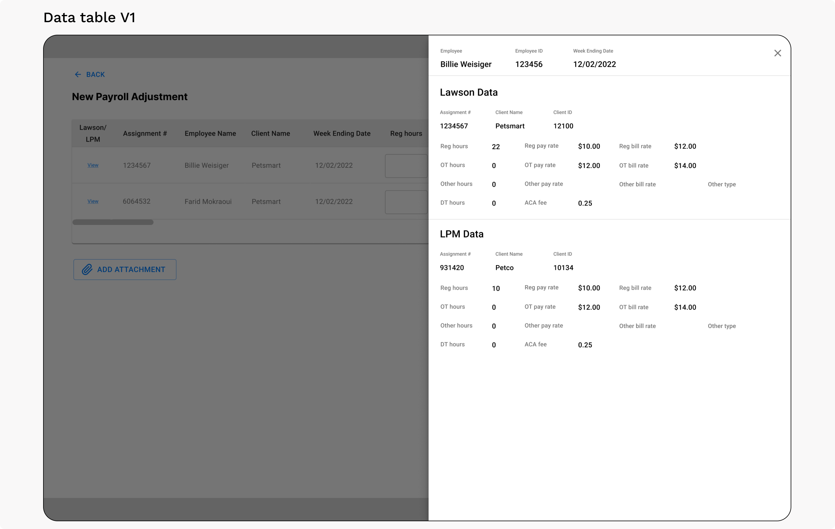
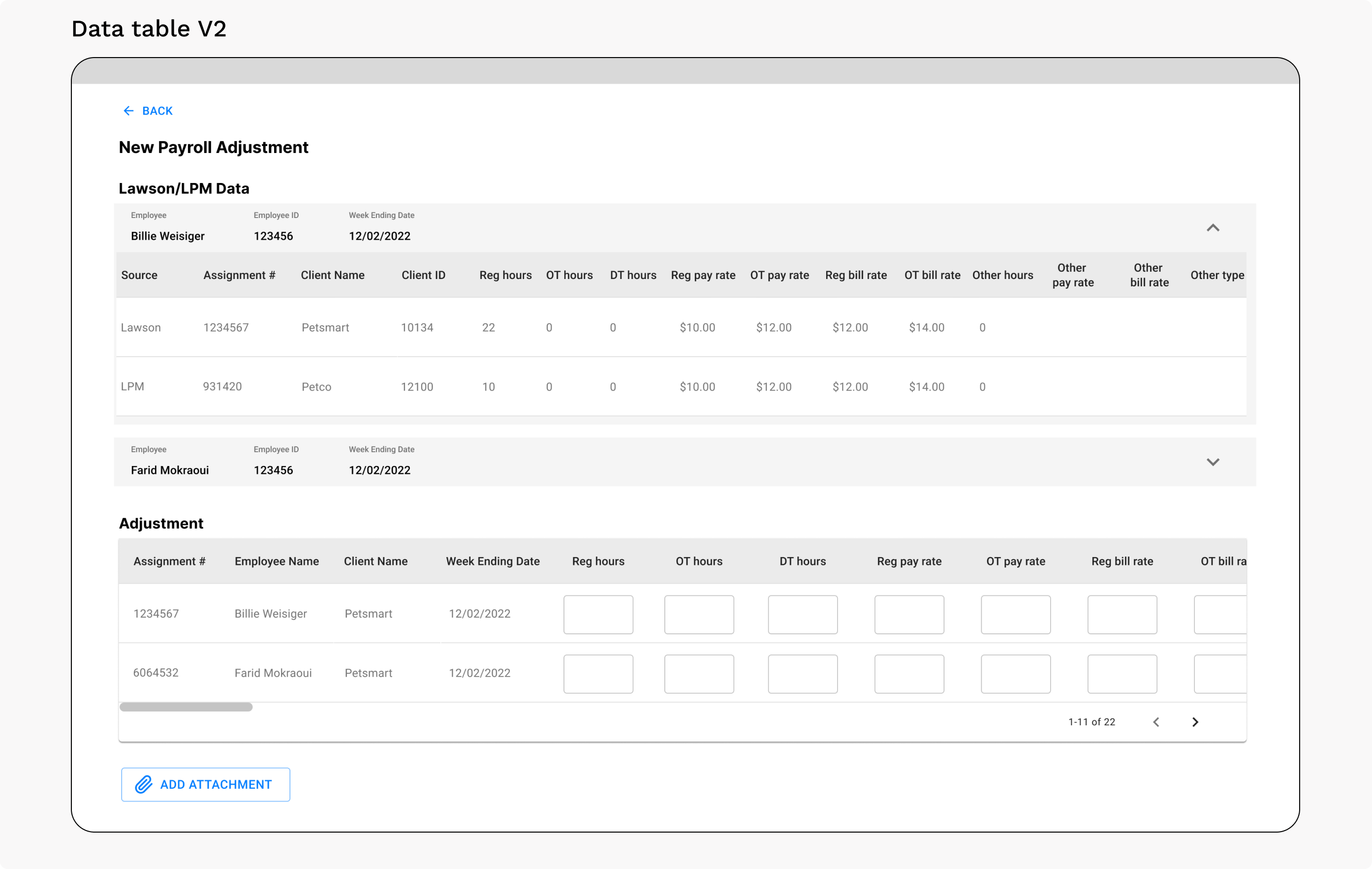
The data table used to present this data is an element that went through several iterations. I first thought about using a drawer pattern (V1 below), but felt like this made the data feel disconnected from the larger context & wasn’t easily scannable. Then I tried a second approach with the data tables above the adjustment fields (V2 below). This made it easier to scan the data, but still felt disconnected.
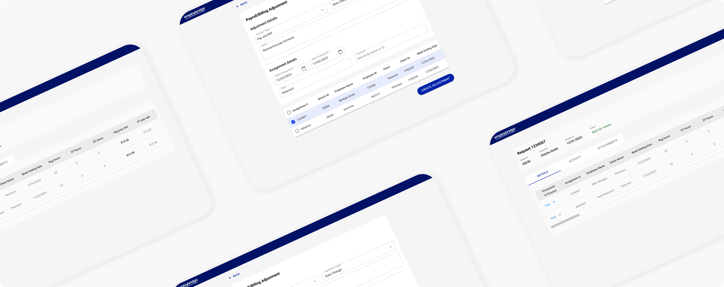
I ended up going with the design below, which allows users to scan the data as they fill out the adjustment fields. This pattern is reused on the approver side, so approvers can quickly see what’s been adjusted next to what the original payment data is.
Key design feature: Designing with a future state in mind
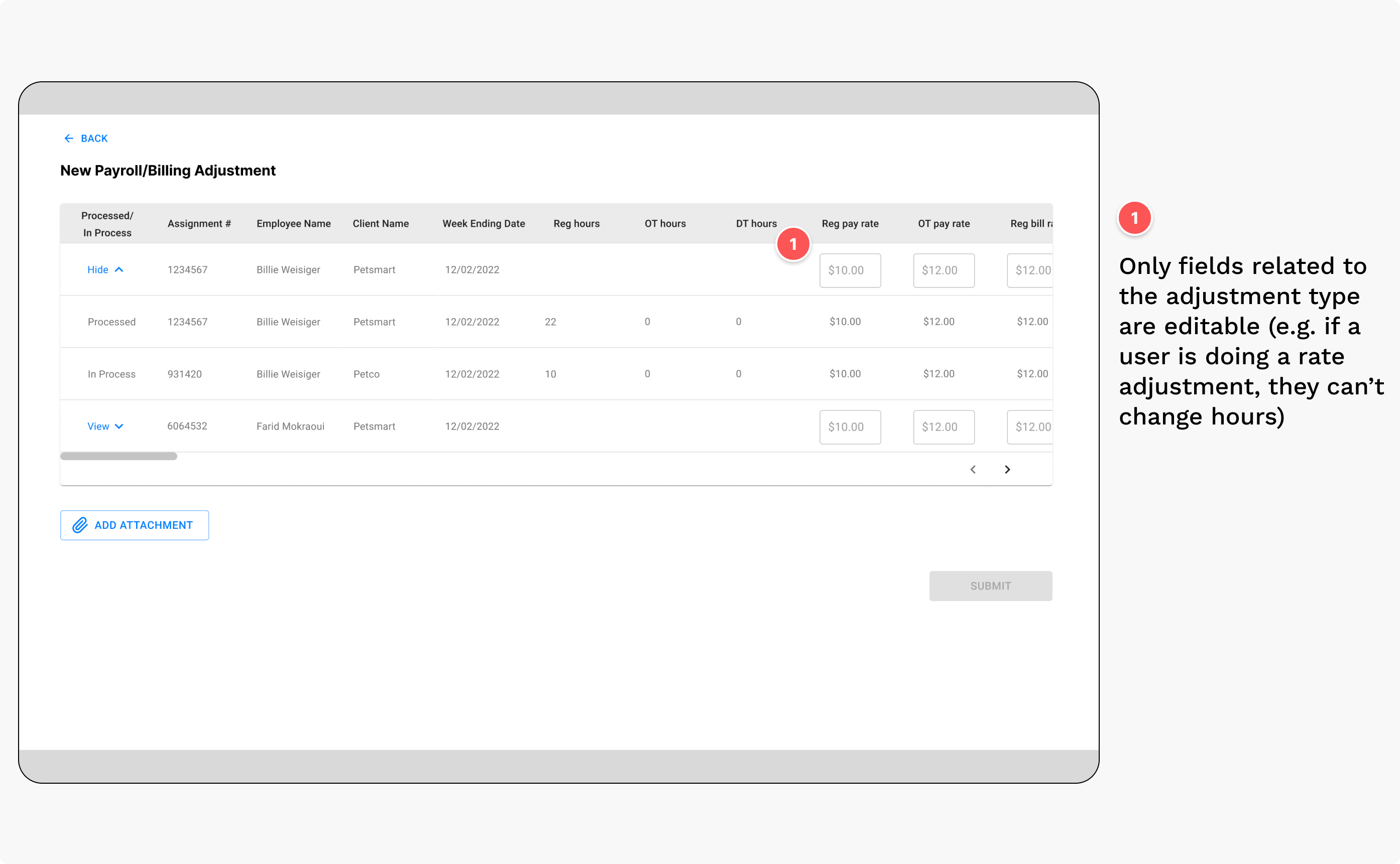
Another consideration I had in mind while designing was how to set up this tool for future iterations. Business stakeholders expressed that they want to be able to automate more of this process down the line; they eventually want to get to a place where we don’t need people going in to approve all of the adjustments. Because of that, I wanted to minimize the risk of human error when entering these adjustments.
The first way I accomplished this was by limiting the fields that a user can adjust. Before getting to the screen to enter an adjustment, the user fills out a form with some details about the action they’re taking, including the adjustment type (pay only, bill only, or pay & bill). The users can then only edit fields that correspond to the chosen adjustment type.
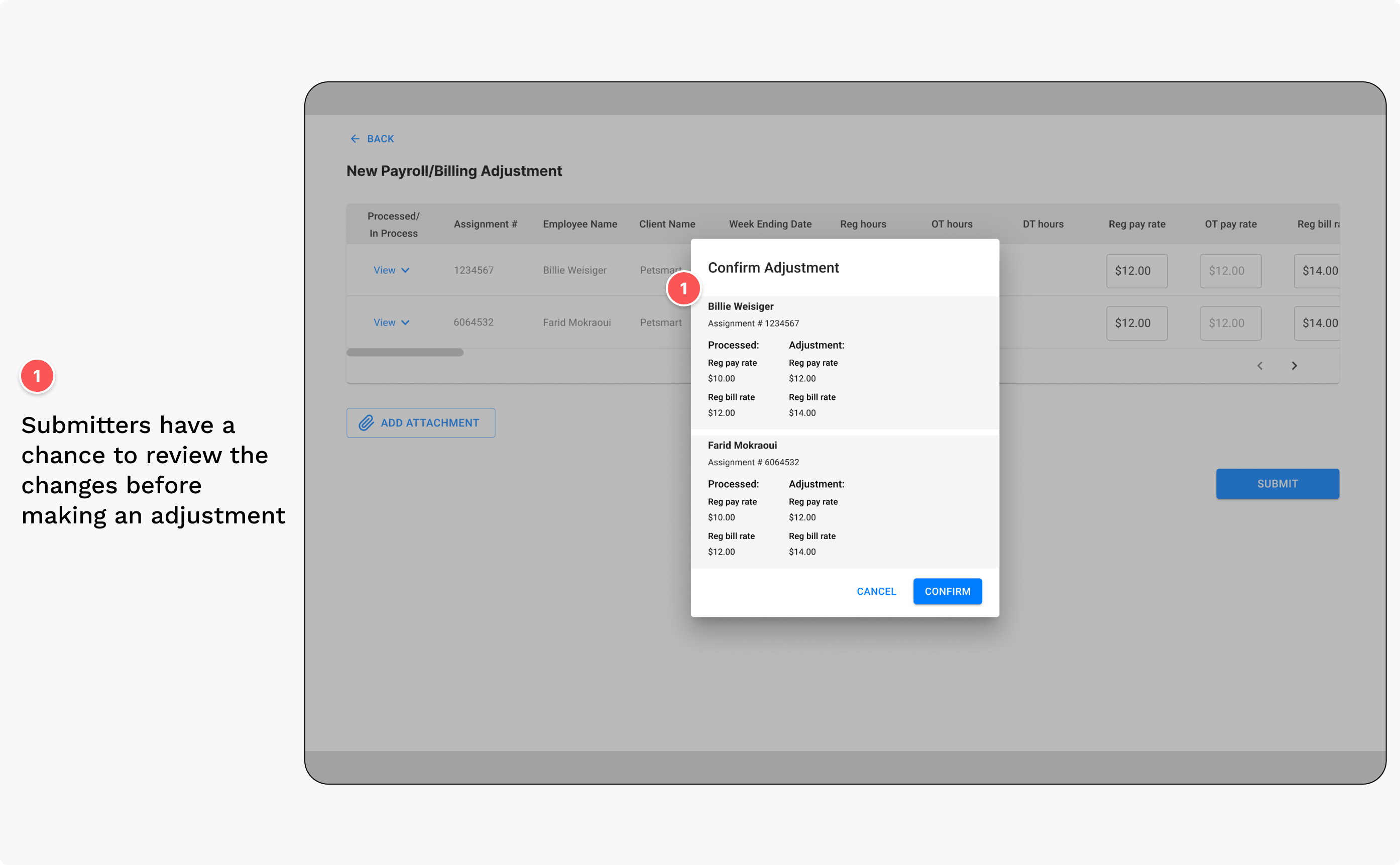
The second way I accomplished this was by adding a confirmation modal after the user submits an adjustment. This adds a pause to the flow and prompts the user to check & confirm that they’re entering the correct information.
Usability Testing
Getting feedback from end users
After creating the designs, I put together a low-fidelity prototype and conducted two rounds of moderated testing per user type (four sessions total). With guidance from the UX research team, I created scripts where I wrote out tasks to give the users to complete in the prototype.
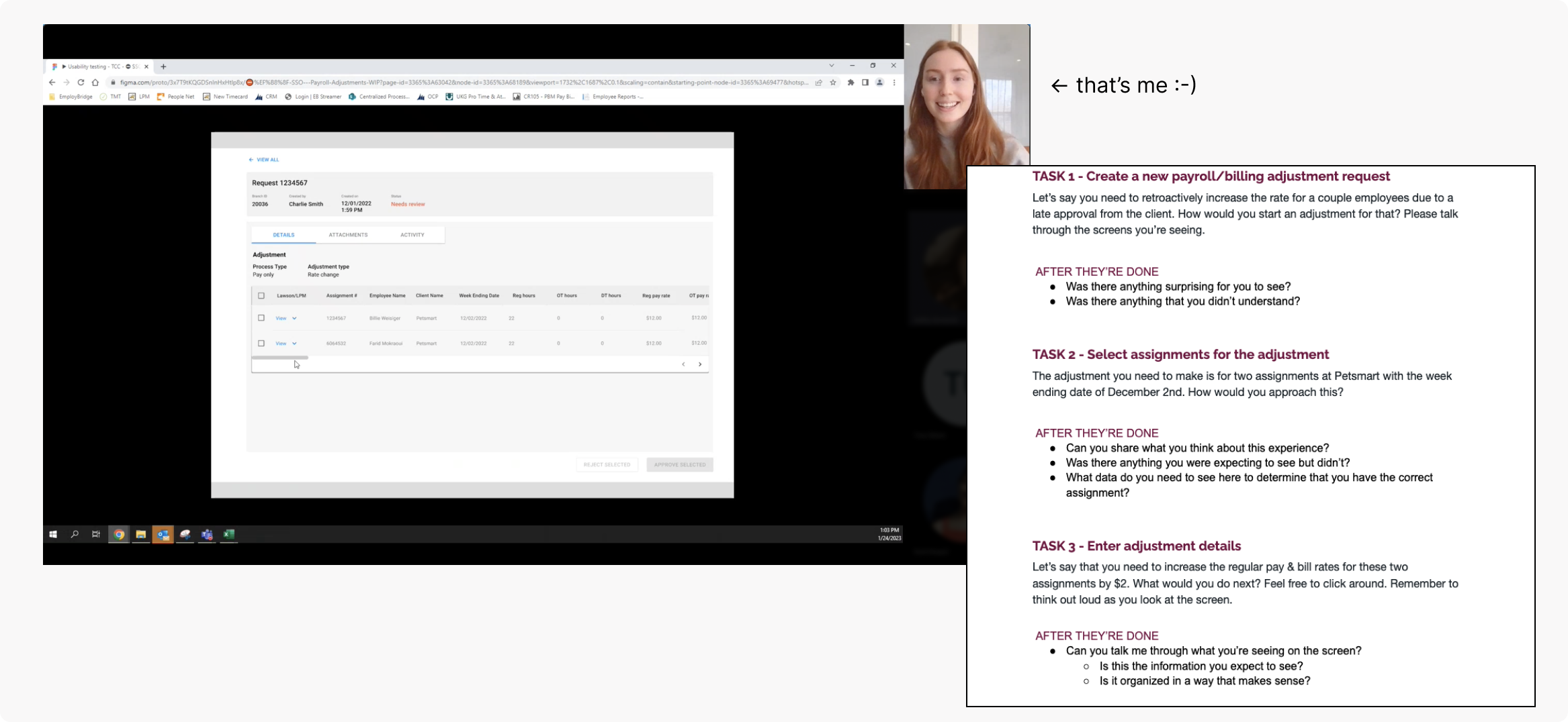
All of the testers were able to accomplish the given tasks. Most of the feedback was positive and validated the designs that were put together. Everyone I talked to was really excited about this tool and wanted to know when it would be available to use, which was encouraging.
One design change that came out of the tests, though, was changing language. Users didn’t understand the terms “Lawson” and “LPM” that I used in the wireframes. These were terms referring to the payroll databases. I changed those to “Processed” and “In Process”, which instead describe the data they’re seeing which users agreed made more sense to them.
Results
A more streamlined experience
Not only were users excited about this tool during testing, but it also cut the number of steps in about half. The new process also centralizes the user flow and eliminates the need for users to reference external databases.
This work is currently in production and expected to roll out later this year.